

FORM FIT
Redefining Pilates with a Bold Retro Twist
Industry
Fitness, Pilates Studio
Market
United States, Los Angeles
The brief
The brief
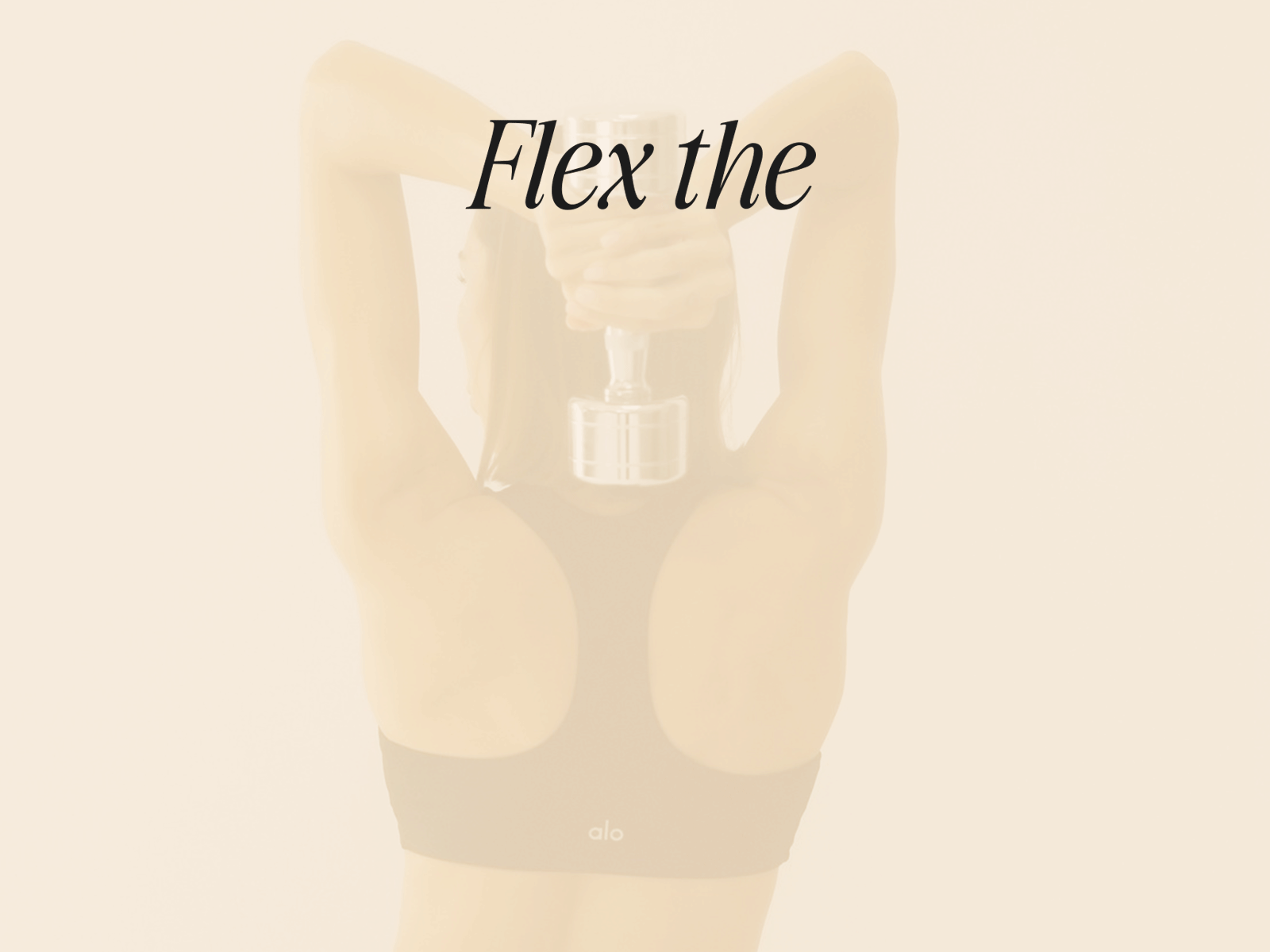
Form Fit isn’t your typical Pilates studio—it’s a revolution in movement, style, and self-expression. Inspired by the retro aesthetics of the 80s and 90s fitness culture, Form Fit reimagines Pilates as something vibrant, daring, and unapologetically fierce. The studio’s mission was clear: to create a brand that doesn’t just blend into the wellness space but boldly stands out.
This isn’t about soft pastels and serenity—it’s about owning your power, breaking a sweat, and doing it all with style. The goal was to disrupt expectations and bring a fresh, dynamic perspective to Pilates—one that makes you think not just about fitness, but about empowerment, individuality, and fun.
The design
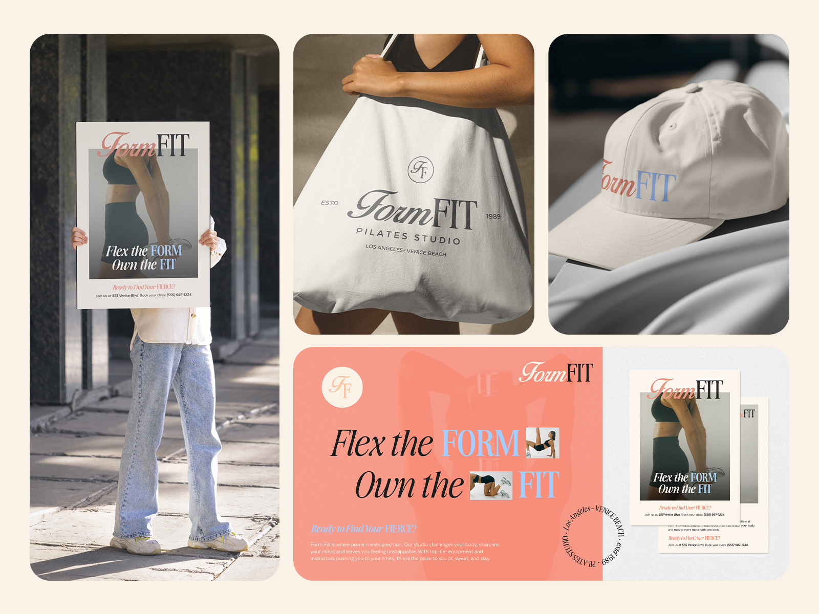
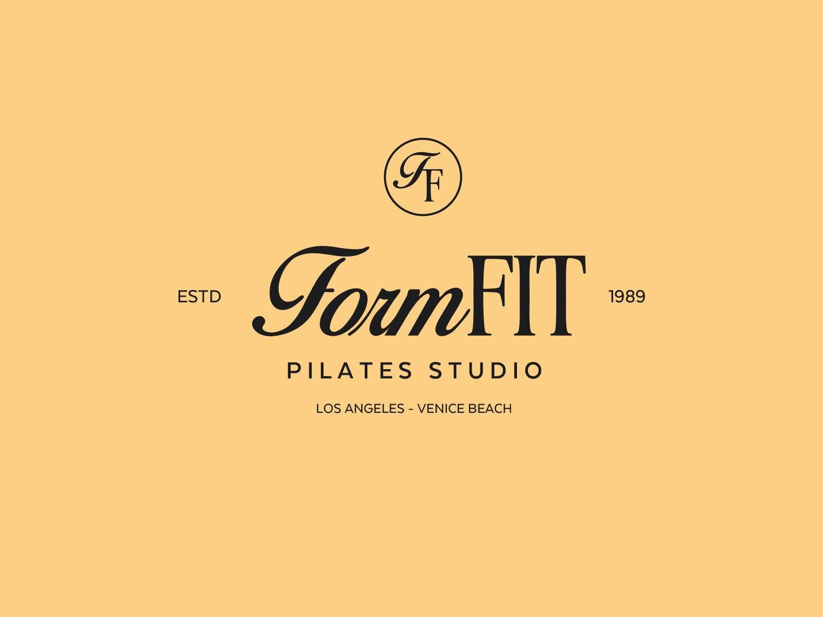
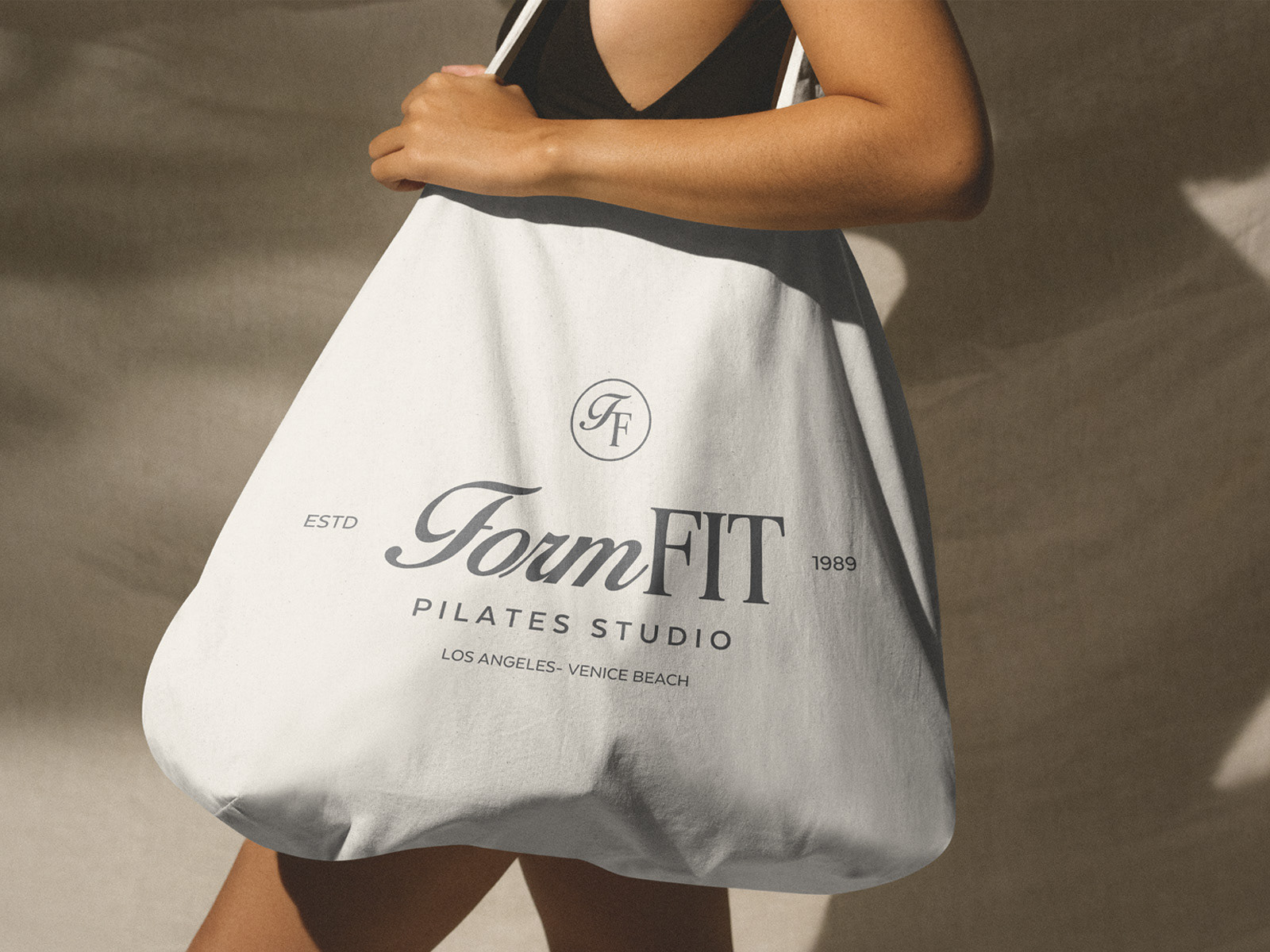
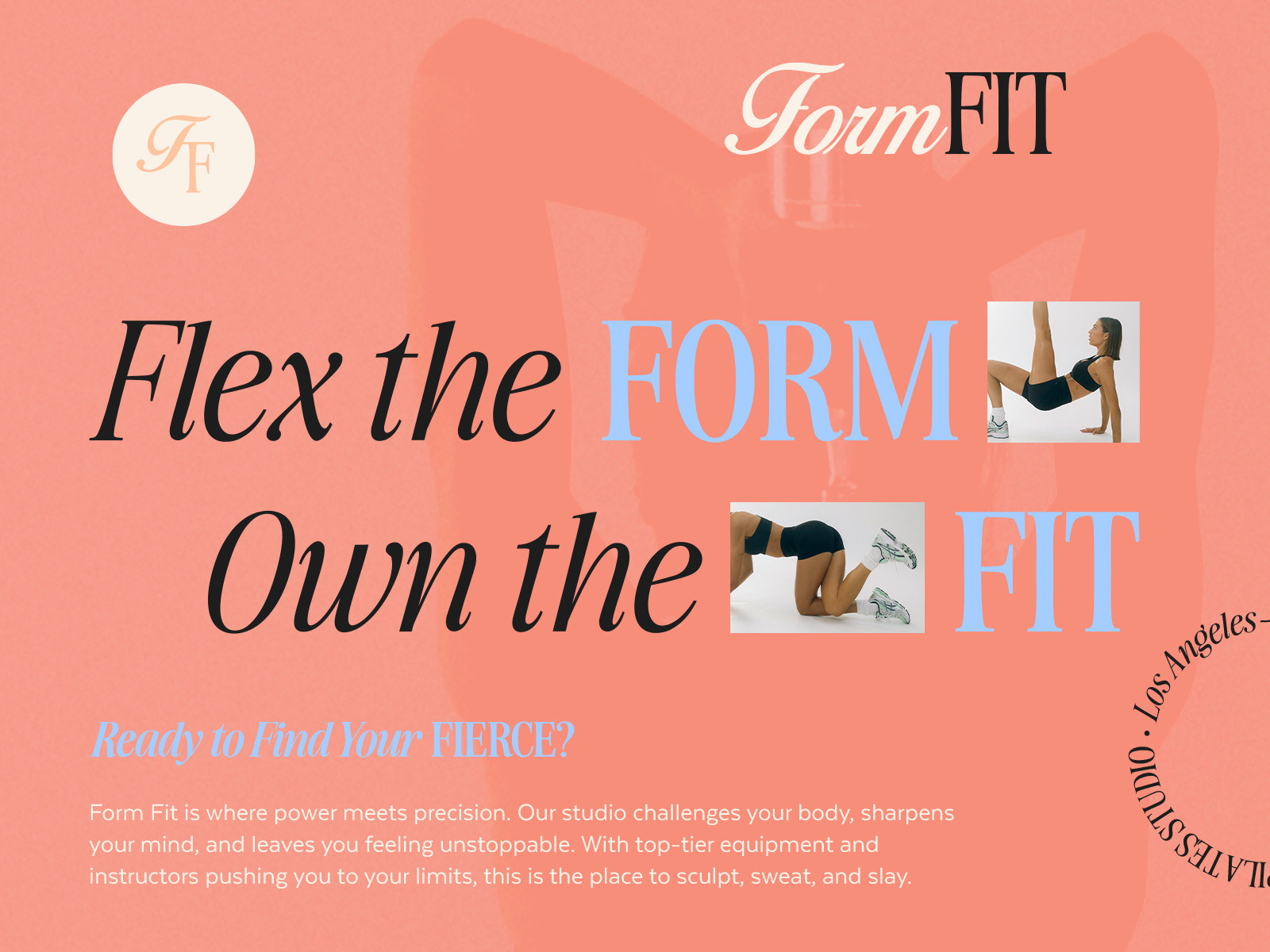
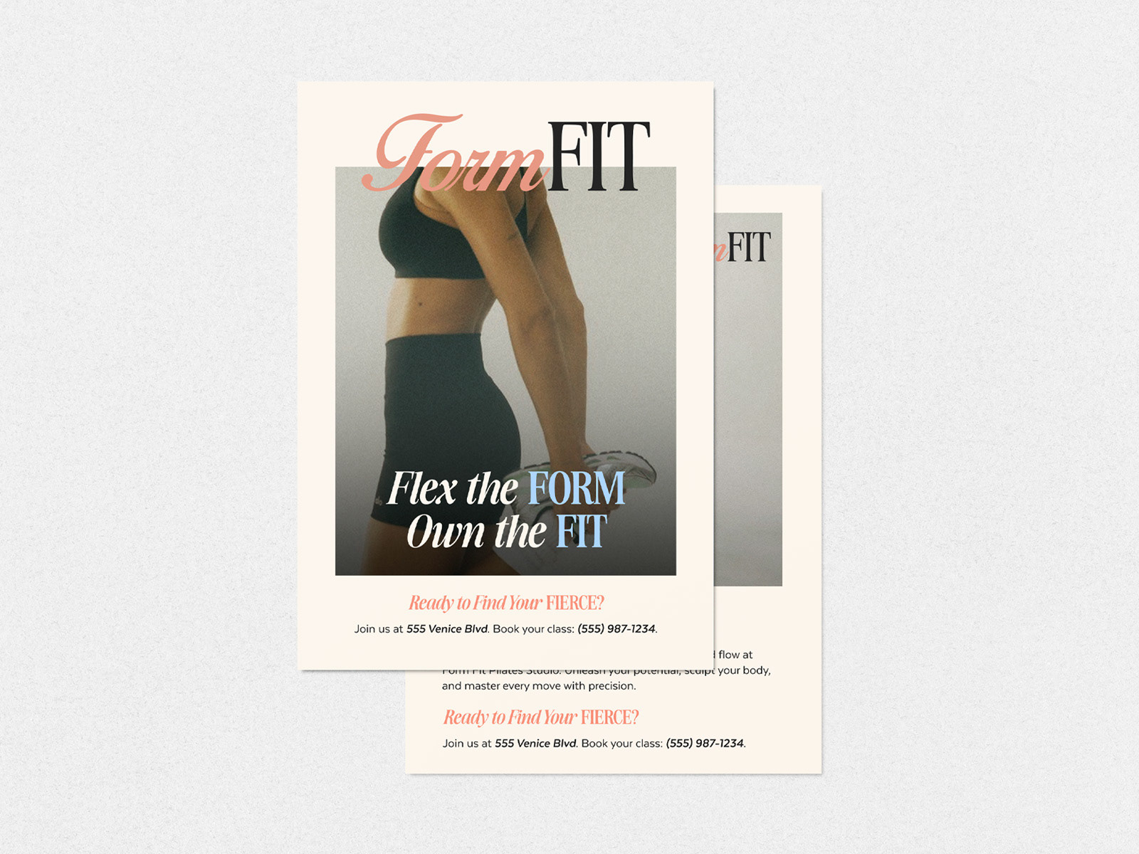
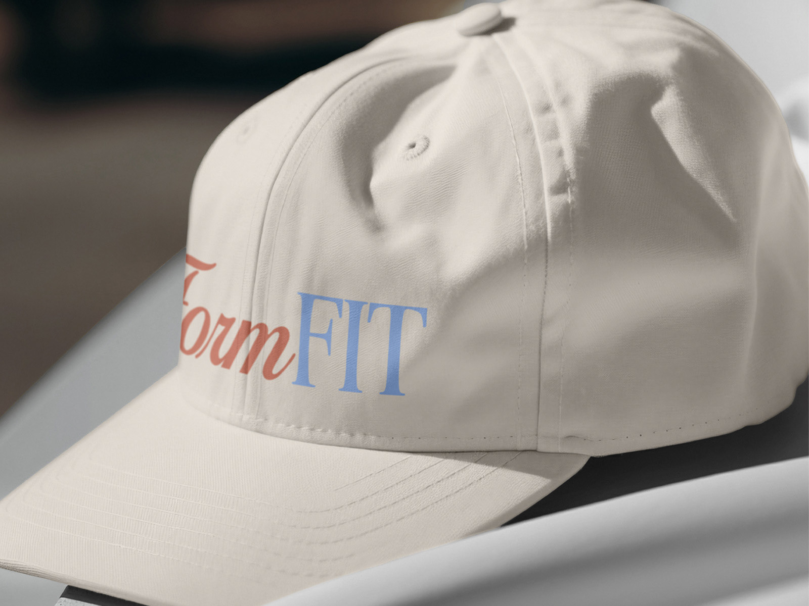
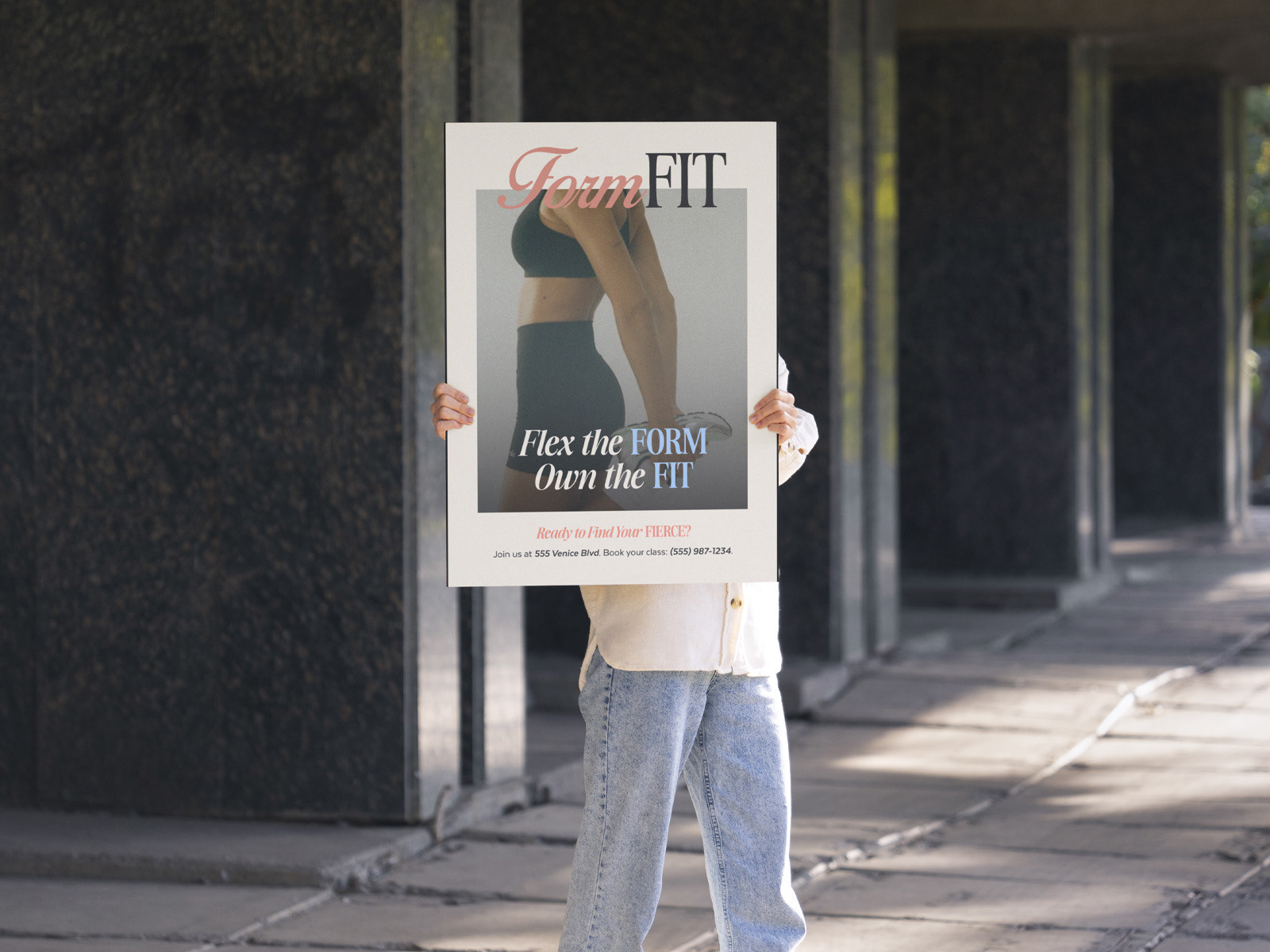
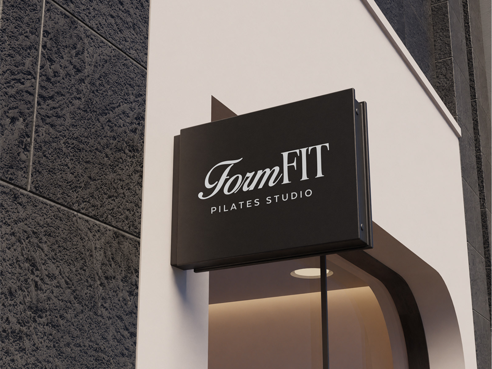
The Form Fit identity is a love letter to retro energy fused with modern sophistication. The logo features a mix of a flowing script font and a bold serif, striking the perfect balance between movement and strength. This combination gives a nod to classic fitness branding while bringing in a contemporary edge.
The color palette was deliberately chosen to evoke a sense of vibrancy and nostalgia. Warm peach tones paired with sky blue and creamy neutrals exude retro charm, while the sharp black accents provide modern contrast. The typography and layouts are playful yet controlled, echoing the precision of Pilates while adding a sense of movement and excitement.
Every design element works together to challenge the traditional perceptions of Pilates and introduce something fresh, fun, and completely unforgettable.
Form Fit isn’t just a Pilates studio—it’s a lifestyle statement, a creative revolution, and a reminder to own your form, your fit, and your power.
Let's Connect!
If you're inspired by my work on SNÖ, I'd love to hear from you! Whether you have a project in mind or just want to share your thoughts, don’t hesitate to get in touch.