Redesigning a brand where function meets feeling.
Industry
Lighting, Energy Efficiency
Market
Serbia
The brief
Helios has been a reliable name in the Serbian lighting market for over two decades. Known for energy-efficient, high-quality products, their mission goes beyond illumination—it's about beauty, safety, and sustainability.
My task was to redesign the logo while maintaining the essence that long-time customers still recognized. The brand needed to feel modern, but familiar. Innovative, but rooted.
The design
The updated logo breathes new life into the brand while keeping its most recognizable element: the yellow strip. No longer a background shape, it now weaves through each letter, symbolizing connection, flow, and continuity.
I introduced a stylized sun motif to subtly reinforce the brand’s name and core values. This reference to Helios, the Greek god of the sun, isn’t just symbolic—it anchors the brand in timelessness and clarity. The identity is designed to evolve with the company’s vision, just as their products evolve with technology.
The result is a visual language that communicates trust, innovation, and light, with purpose.
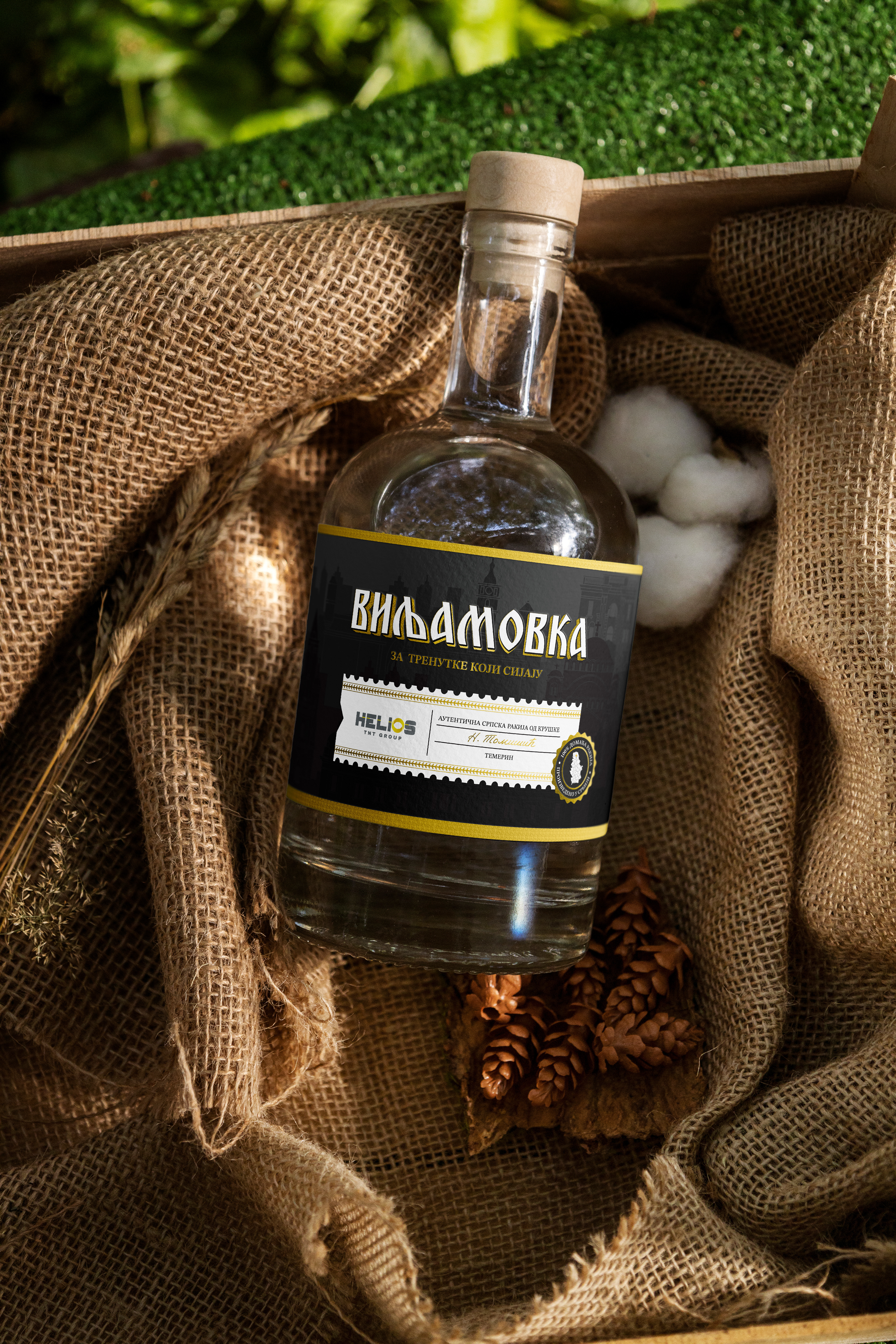
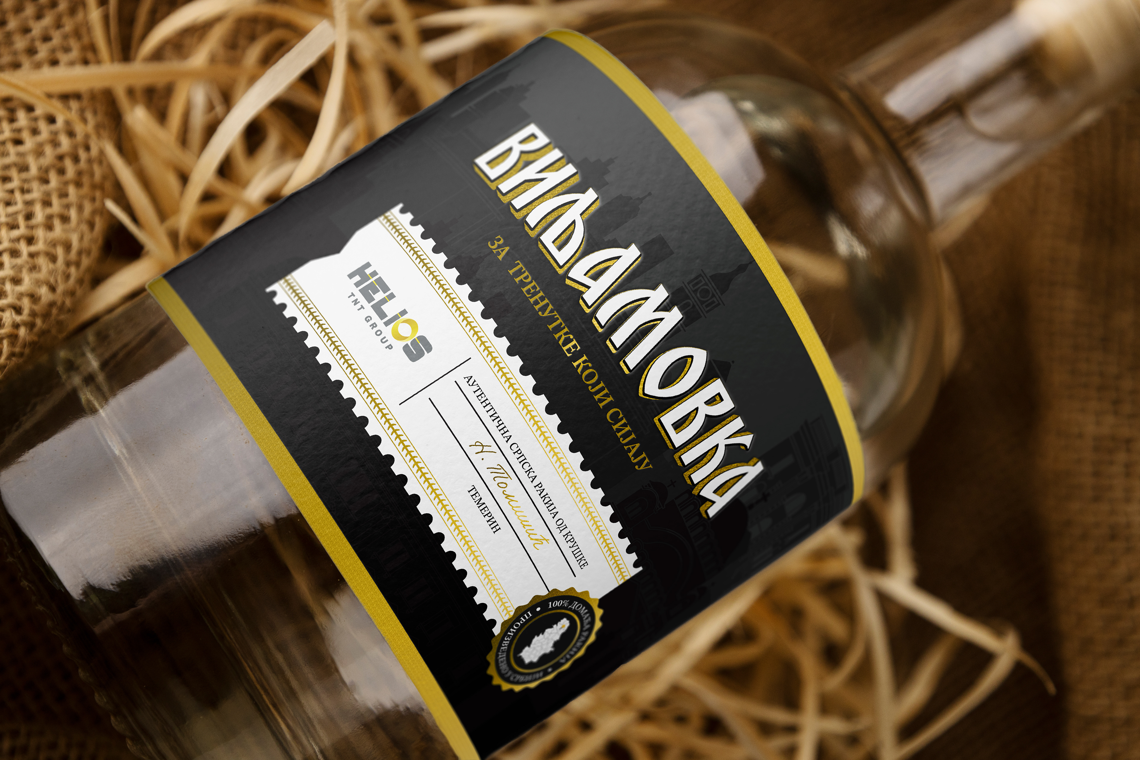
Besides their primary job, as big brandy (rakija) lovers, they also wanted to produce their homemade rakija. The label design for this series of rakija — featuring pear (Viljamovka), quince (Dunja), and plum (Šljiva) — harmoniously blends tradition with a modern, premium aesthetic. Cyrillic typography evokes a sense of cultural heritage, while gold accents add a touch of luxury and exclusivity. The background showcases subtle illustrations of iconic Serbian landmarks, paying tribute to the product's authentic roots and local history.
The sophisticated design elements highlight the authenticity and quality of the rakija, appealing to both local and international audiences looking for a taste of tradition with a contemporary twist.
"Although Ivana didn't have much information about what we would specifically change in our branding, she patiently marketed ideas. She gave solutions that more concretely led future customers to our field assortment. There were doubts about the colors, but her suggestions were adopted because she reasoned which color leaves an impression on consumers. Ivana is straightforward to work with. Efficient, without a lot of unnecessary talks."
Gordana, Director of Helios


