

Bringing clarity, strategy, and design
into one aligned identity.
Industry
Marketing & Advertising
Market
Serbia
The brief
Visionlab is a digital marketing agency built on clarity, intention, and strategy. The founder, a creative professional deeply rooted in the world of visual storytelling and brand strategy, approached me with a request to shape a visual identity that reflects both her personal philosophy and the values of the agency.
The goal was to create a brand that feels focused, modern, and unapologetically minimal. A brand that doesn’t try to say everything at once, but says the right thing, clearly. Every element needed to be purposeful: from the logo and typeface choices to the tone of voice and supporting visuals. The identity had to align with the agency’s core: helping businesses grow through smart, well-structured communication.
The design
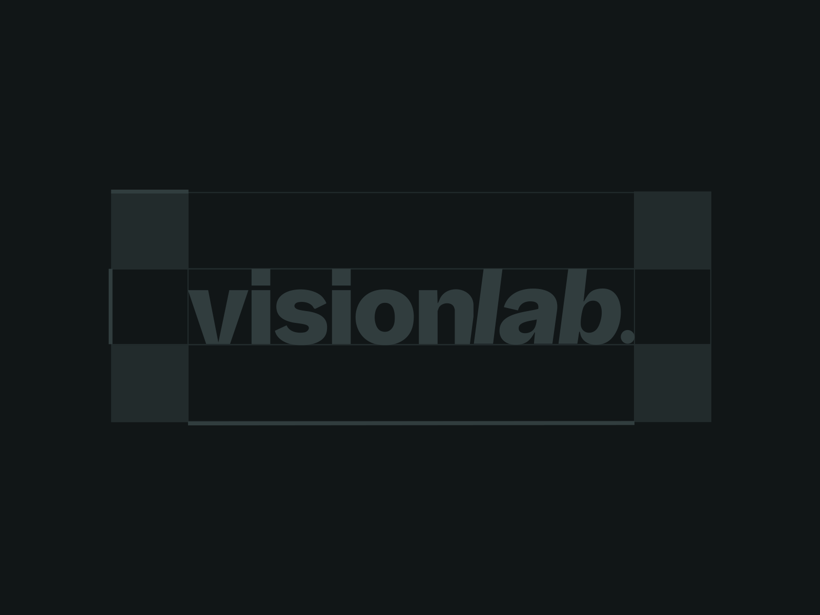
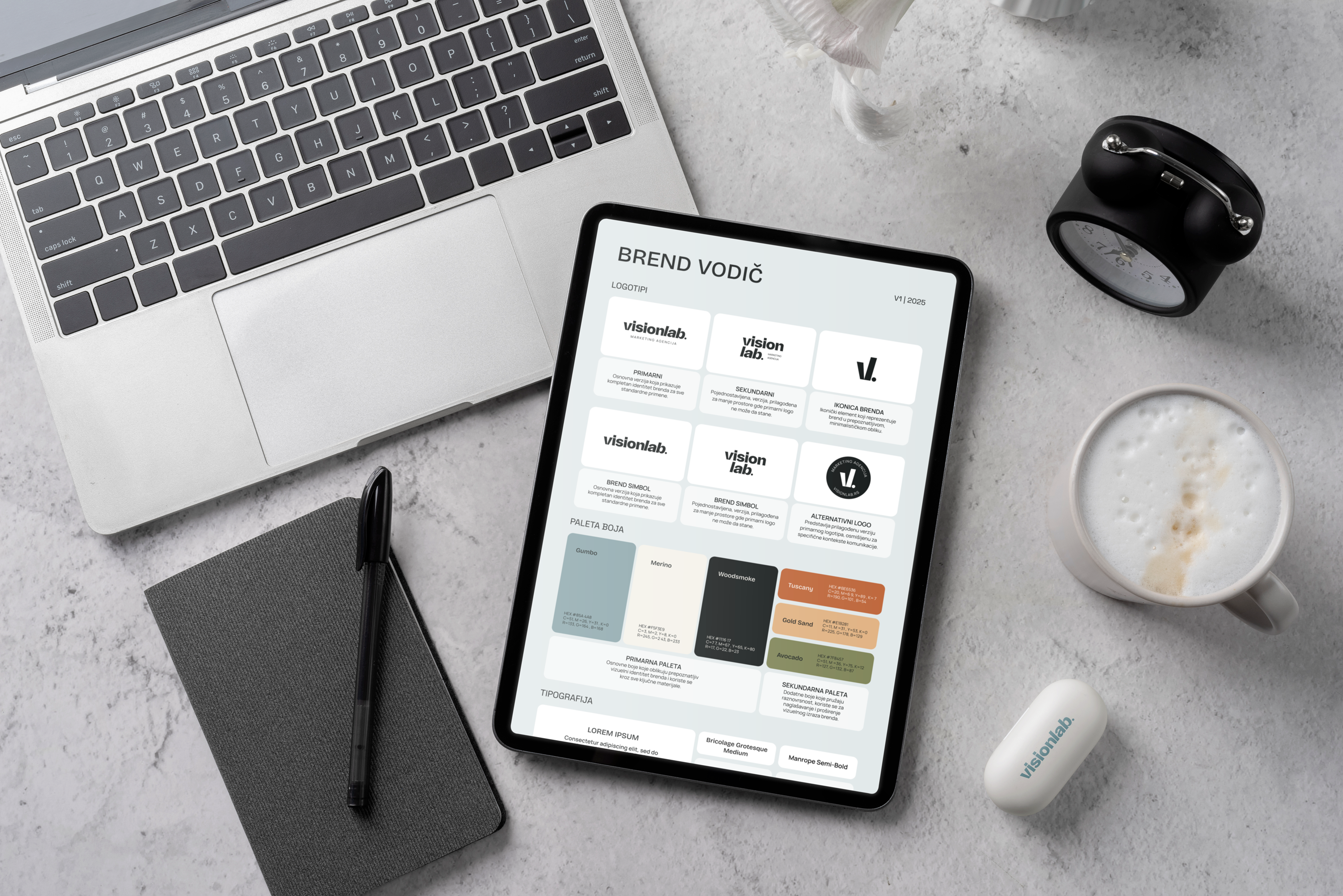
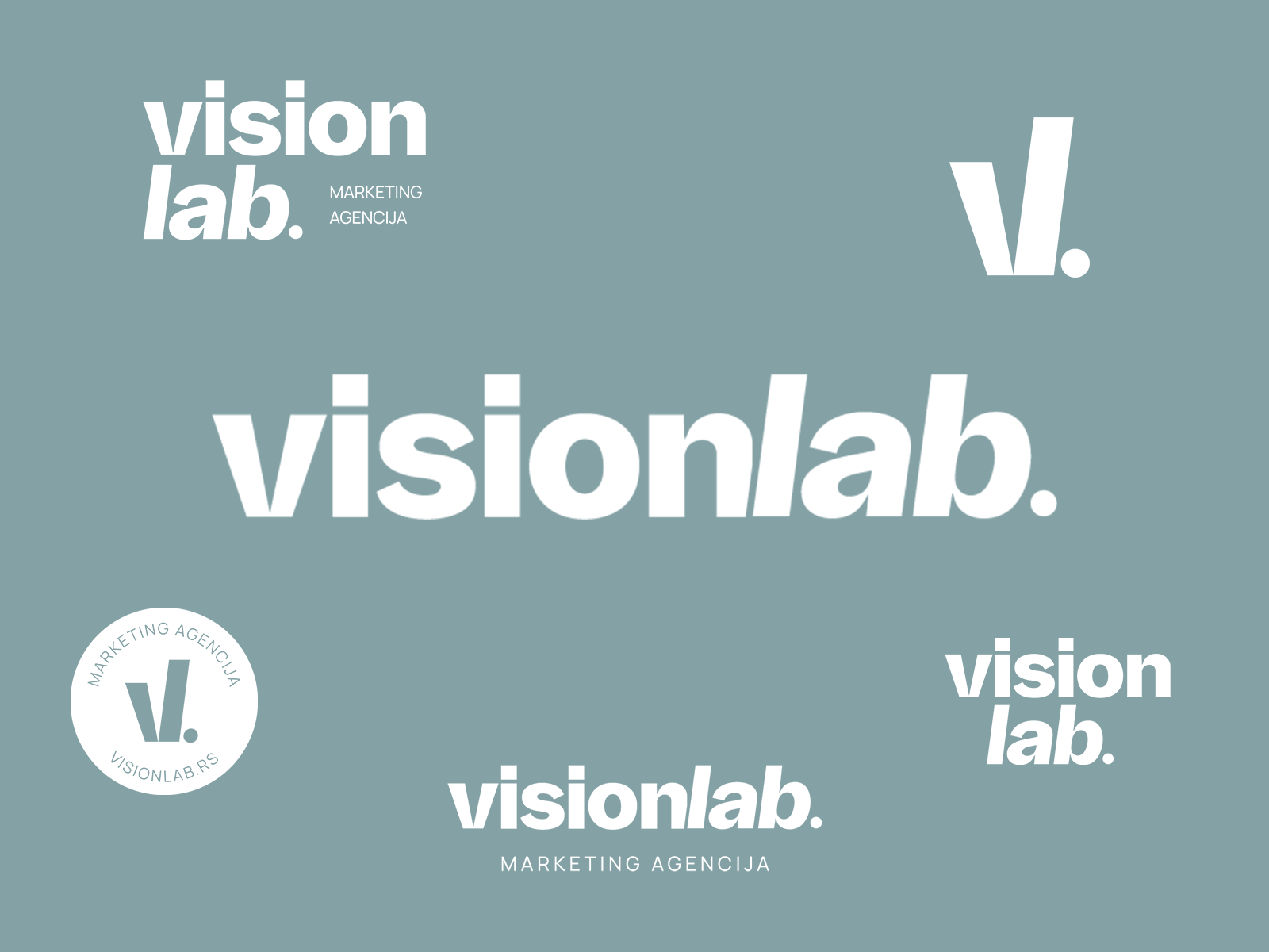
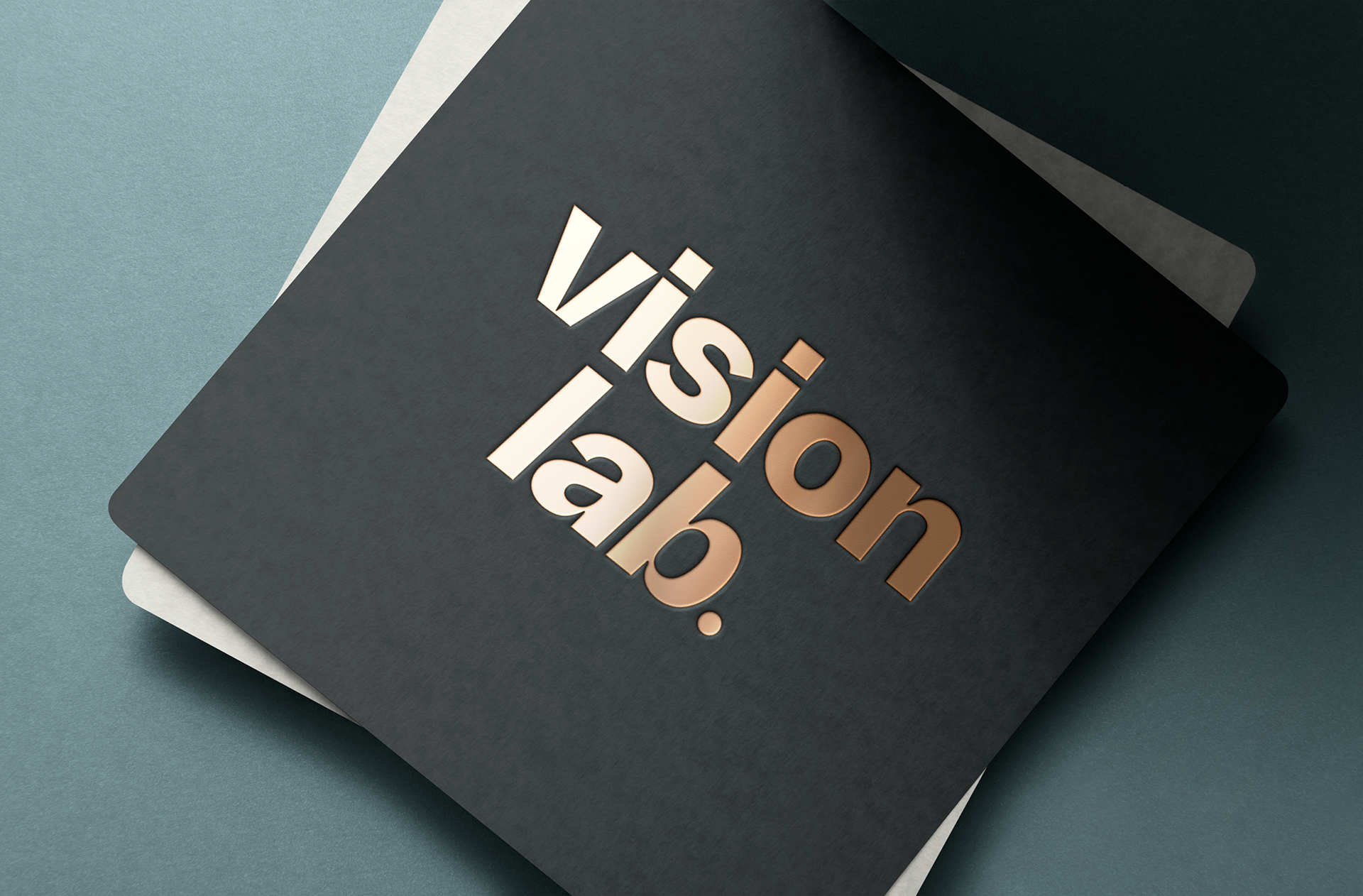
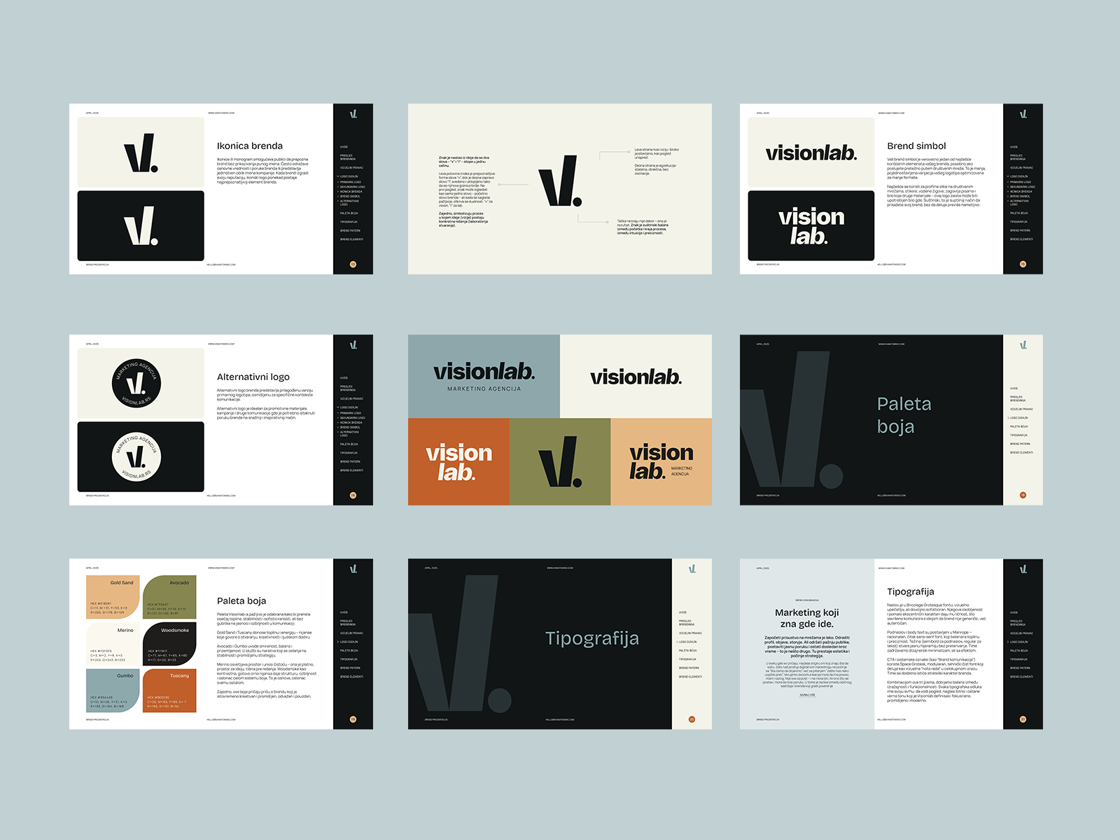
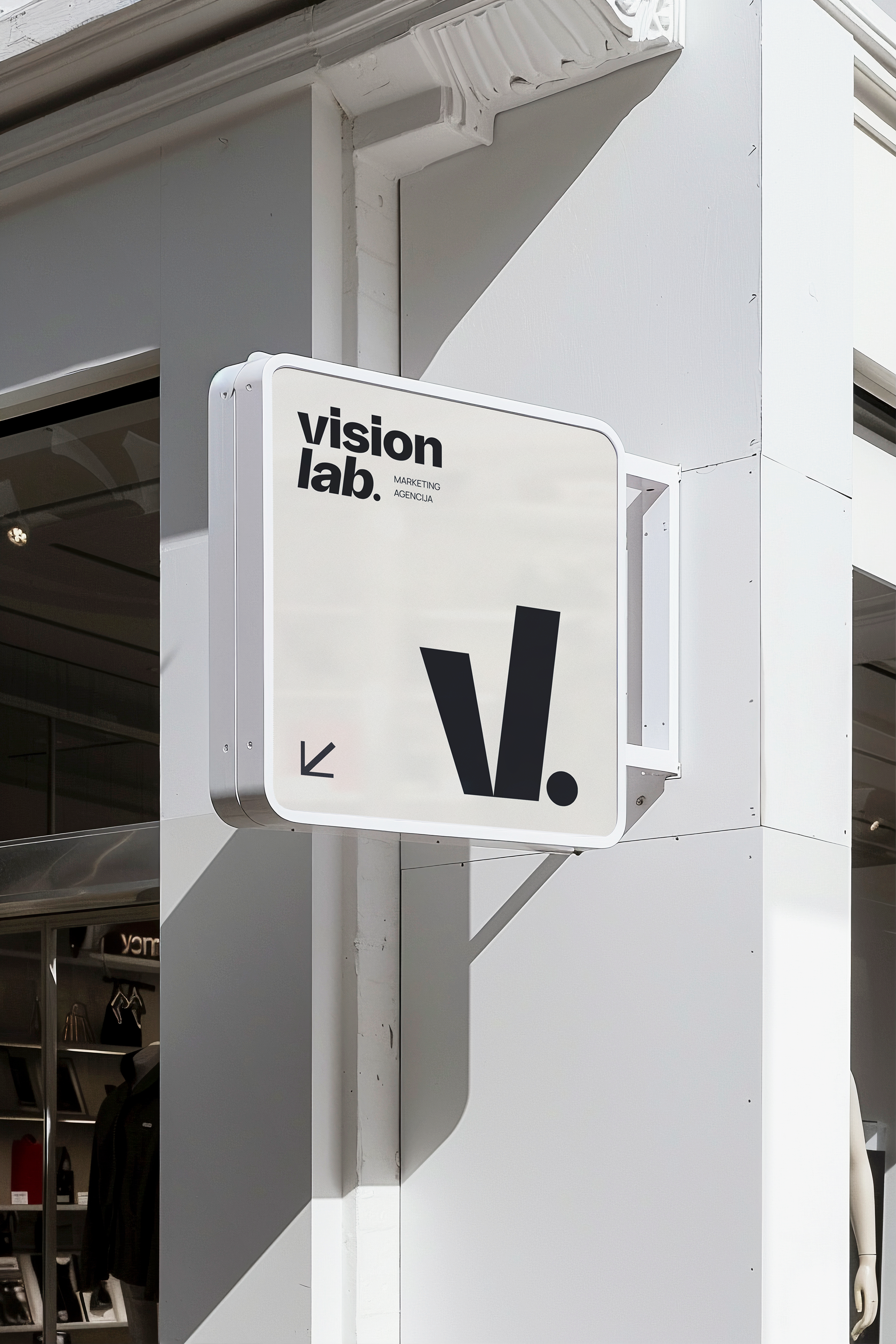
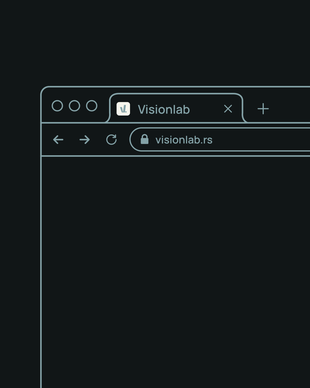
The logo design began with a custom wordmark that merges contrast and simplicity. The word VisionLab is split into two parts: vision, standing steady and clean, and lab, italicized to suggest movement, experimentation, and flexibility. A full stop anchors the design, reinforcing the brand's clarity and confidence.
The icon is a custom ligature: a fusion of the letters v and l, subtly forming a single shape that nods to both the brand name and its strategic duality — vision meets execution. While abstract, it remains recognizably grounded in the brand’s initials, making it conceptually rich yet visually simple.
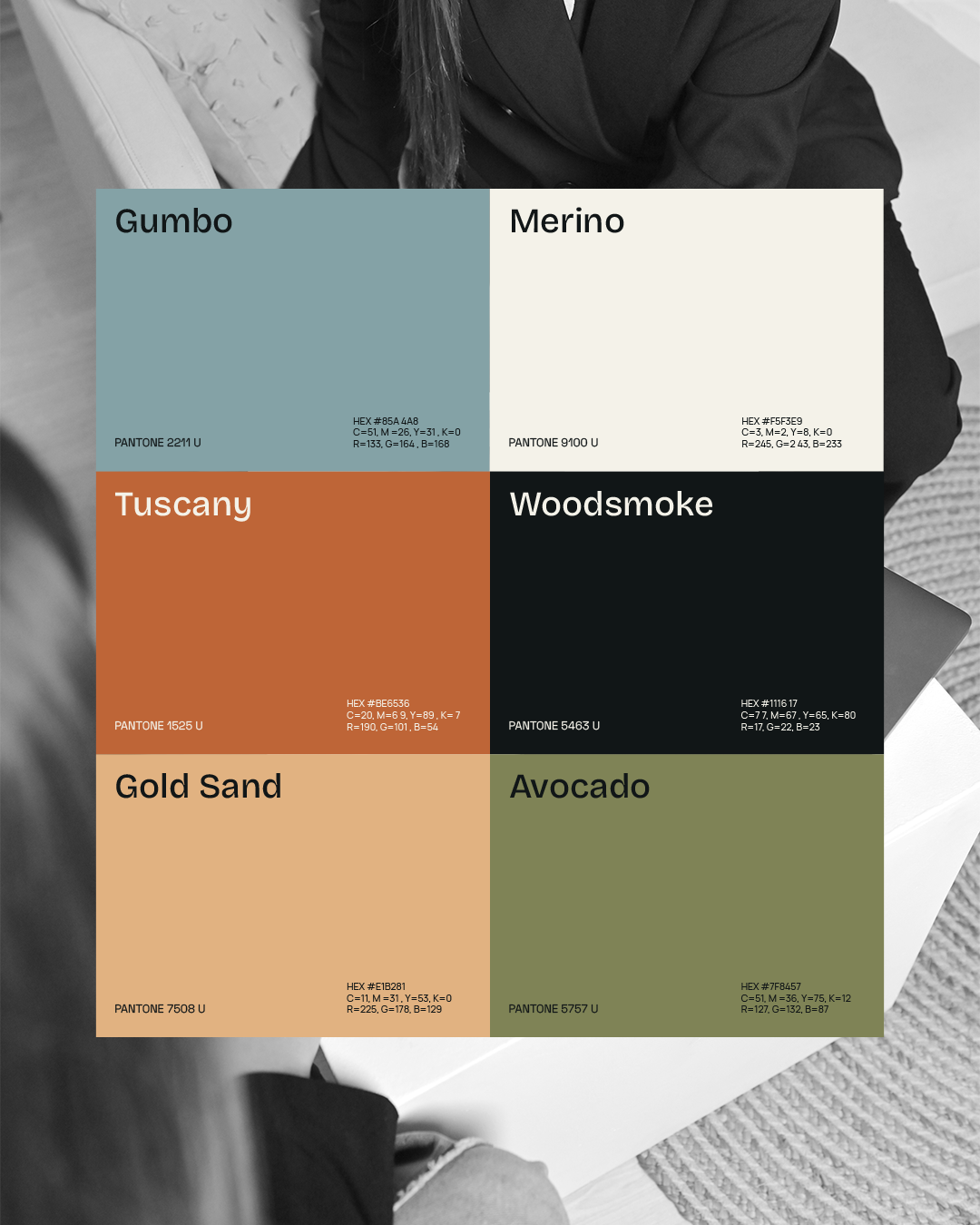
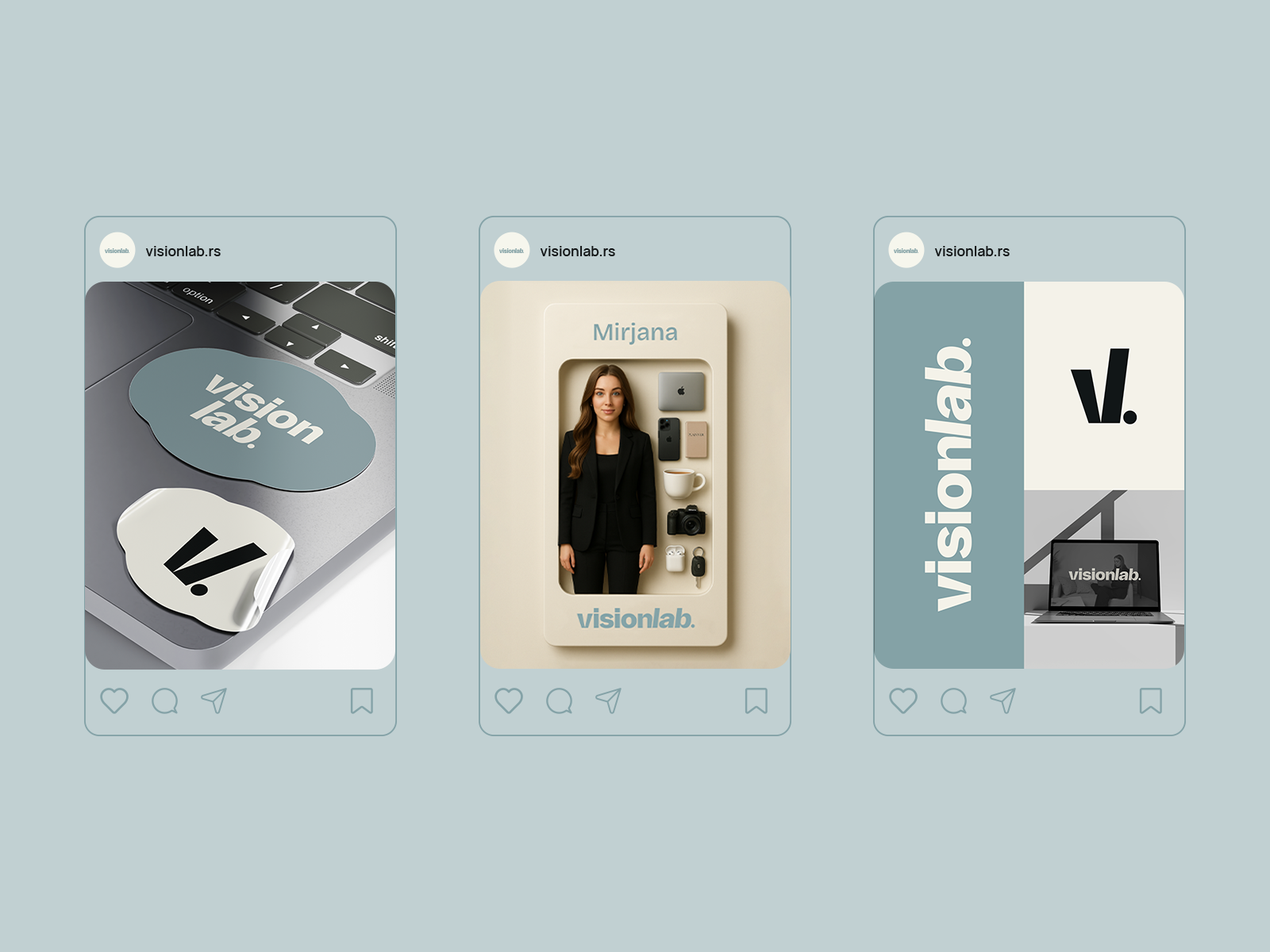
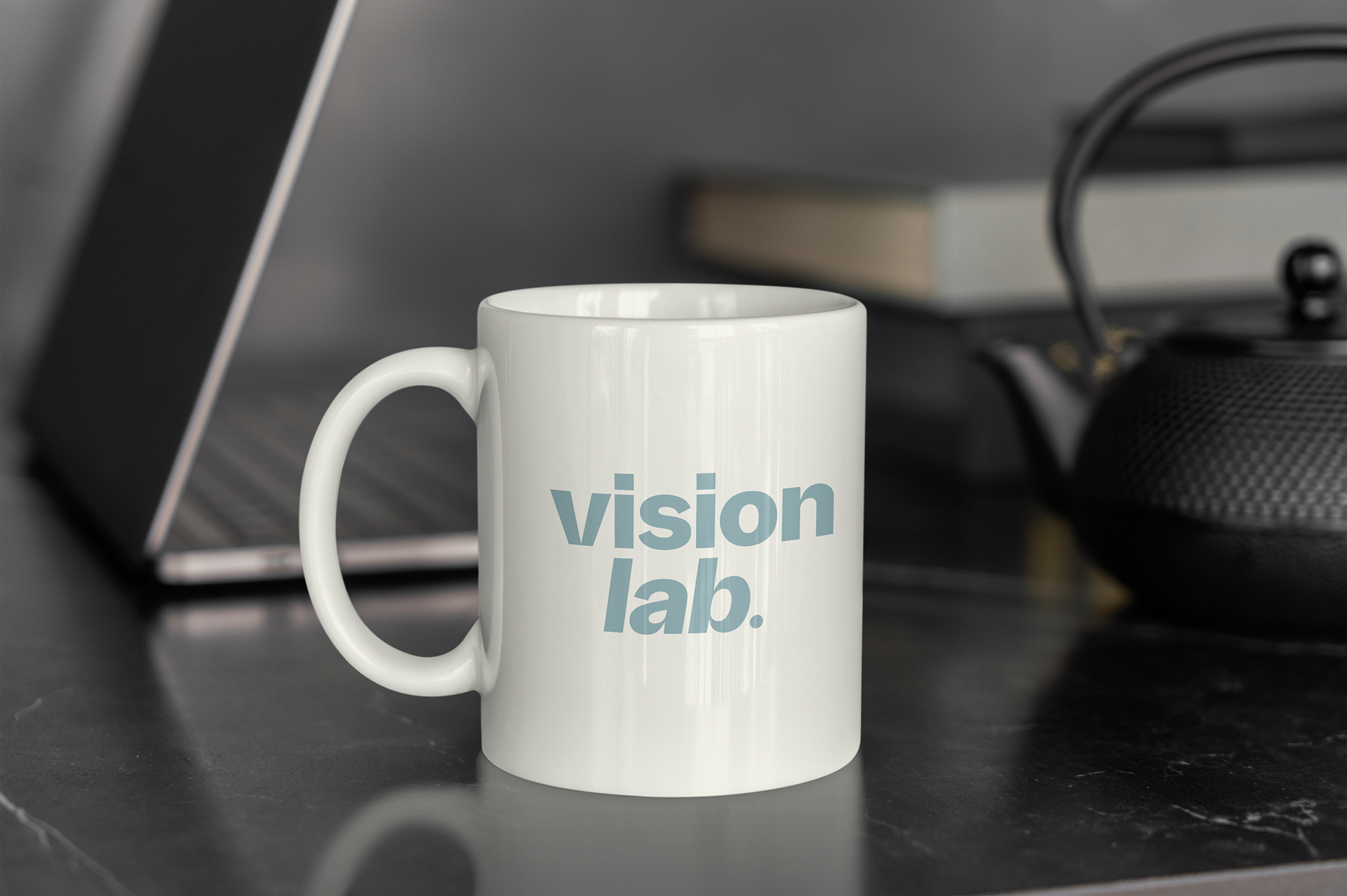
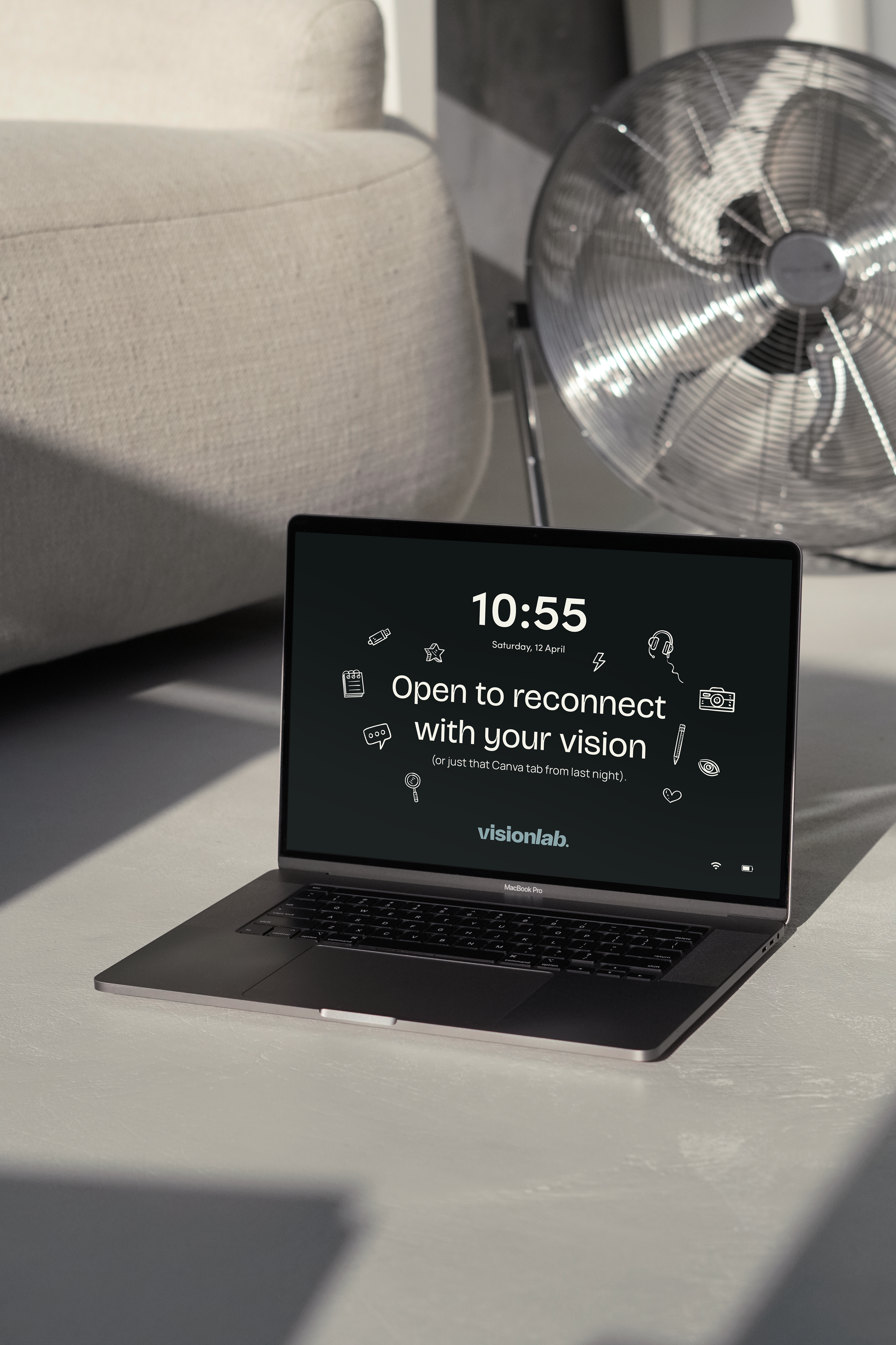
The color palette is soft and muted, with earthy tones and neutral contrasts. It balances warmth and professionalism, approachable yet elevated. The typography system combines expressive and structured fonts: a bold, distinctive display type paired with a clean, legible sans serif for supporting text.
Supporting elements include a set of hand-drawn brand assets and a dynamic layout system that can flex across digital and print applications. Patterns and illustrations add a human layer to the otherwise structured system, reinforcing the brand’s balance between clarity and creativity.
This identity is not just a visual system, it’s a reflection of how Visionlab works: with intention, intelligence, and style.


“Working with Ivana has been an experience marked by the highest level of professionalism, clear communication, and timely delivery. Everything was communicated with clarity and precision. Her talent in graphic design truly knows no bounds, she managed to bring all my ideas together into one cohesive design: VisionLab. I genuinely look forward to working with her again.”
Mirjana, Owner of VisionLab